
Favicon Generator
One image in, a full favicon set out — with a real 16px preview before you commit
Drop your logo here
or click to pick a file — PNG, JPG or WebP. A square image at 512 px or larger works best.
Nothing is uploaded. Every file is drawn and encoded inside your browser.
Before you start with Favicon Generator
Generate a multi-size favicon set, Apple touch icon, Android icons, and copy-ready HTML snippets from one image in the browser.
Best for
- Creating the common favicon and mobile icon files for a website
- Checking how a logo reads at the real 16px browser size
- Copying ready-made head and manifest snippets into a site
Know before you start
- The generator starts from one raster source and does not redesign a logo
- Very detailed marks may not remain readable at 16px
- A changed favicon can remain cached by browsers after deployment
Continue the workflow
How to use it
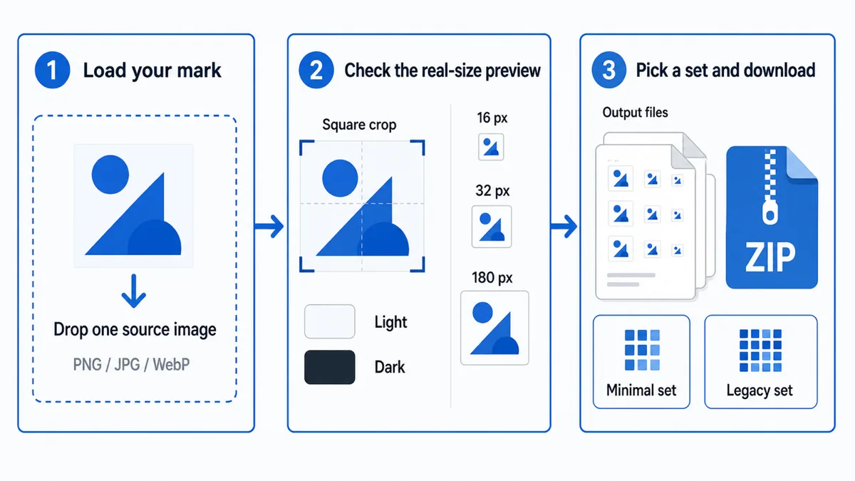
1. Load your mark
Drop in a PNG, JPG or WebP — a square image of at least 512 px gives the best results, because 512 is the largest file produced and nothing is invented when scaling up. A non-square image gets a square crop frame you can drag along its long side, or you can switch to Fit and letterbox it instead. Either way it is never stretched. The panel reports the dimensions and whether the image has transparency, and warns you when the source is under 512 px, because the 512 px file is then upscaled and arrives soft. Fit is the honest option when nothing can be cut, but be aware of what it costs: a wide logo becomes a small mark with empty strips above and below it, which is a lot of dead space in a 16 px tab.
2. Check the real-size preview
The three squares are drawn at 16, 32 and 180 real pixels on both a light and a dark swatch, and the mock browser tab below them puts the 16 px version beside a page title where you normally see it. This is the step most generators skip, and it is the one that saves you: if the 16 px square is a smudge, no amount of exporting will fix it, and you need a simpler mark instead. The image size and corner radius sliders feed the same previews, so padding and rounding show up before you download anything.
Two details in that panel are worth knowing. The dashed outline around each square is the icon’s actual bounds — without it, an icon that has been letterboxed or shrunk by the image size slider is indistinguishable from a smaller icon, because the empty area simply takes the swatch colour. And the light and dark swatches both show whatever transparency survives your background choice, which is how a pale halo baked into the artwork shows up on the dark swatch and a dark one on the light swatch. The mock browser tab is CSS chrome around that same 16 px canvas, not a real browser; it earns its place because 16 px viewed alone still reads as bigger than it feels next to a page title.
3. Pick a set and download
Choose the minimal set or the legacy set, press Generate, then download files individually or take the ZIP. Copy the head snippet and the manifest from the panel underneath — both list exactly the files you generated, nothing more. The manifest block is a complete JSON object you can save straight to site.webmanifest; it still wants a theme_color and a background_color, which are yours to choose. Fill in the app name and it appears as apple-mobile-web-app-title in the head and as name in the manifest. Leave it empty and neither line is emitted at all, so iOS falls back to your page title — usually the right answer.
Which sizes do you actually need?
| Size | File | Used for |
|---|---|---|
| 16 × 16 | favicon.ico | The browser tab and the bookmark list on a standard-density screen. |
| 32 × 32 | favicon.ico | The tab on a high-density screen, plus Windows taskbar and shortcut surfaces. 48 is bundled for the same reason. |
| 180 × 180 | apple-touch-icon.png | The iOS home screen tile when someone saves your site. Must be opaque. |
| 192 × 192 | android-chrome-192x192.png | Android home screen and the small icon in the web app manifest. |
| 512 × 512 | android-chrome-512x512.png | The installed-app splash screen and the large manifest icon, which install prompts require. |
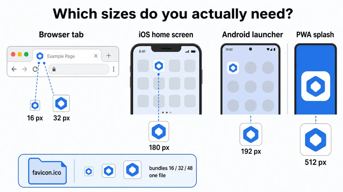
The .ico container is what keeps this list short: it holds several images in one file, so 16, 32 and 48 travel together and the browser picks the one it needs. That is why a single favicon.ico at the root covers every tab case without extra tags. Separate 16 and 32 PNGs are only needed for older browsers that ignore ICO, which is what the legacy set is for.
Two sets of files you may have seen elsewhere are missing on purpose. Windows Metro tiles — browserconfig.xml and the mstile-*.png images — belong to the Windows 8 start screen and the pinned-site feature that went with it; Edge stopped reading them years ago. The MacBook Touch Bar favicon is gone with the hardware. Generating either today just adds files nobody requests and tags nobody parses, which is exactly the clutter the Minimal set exists to avoid.
Why your logo may not work at 16px
A 16 × 16 icon is 256 pixels in total. A wordmark that reads perfectly on a business card has nothing left to render with at that scale, and the usual instinct — make the text bigger — does not help, because the constraint is not font size. It is line density: how many distinct strokes and gaps you are asking the renderer to fit across sixteen pixels. Each stroke needs at least one pixel, and the gap beside it needs one too, so anything with more than a handful of features per side turns to grey.
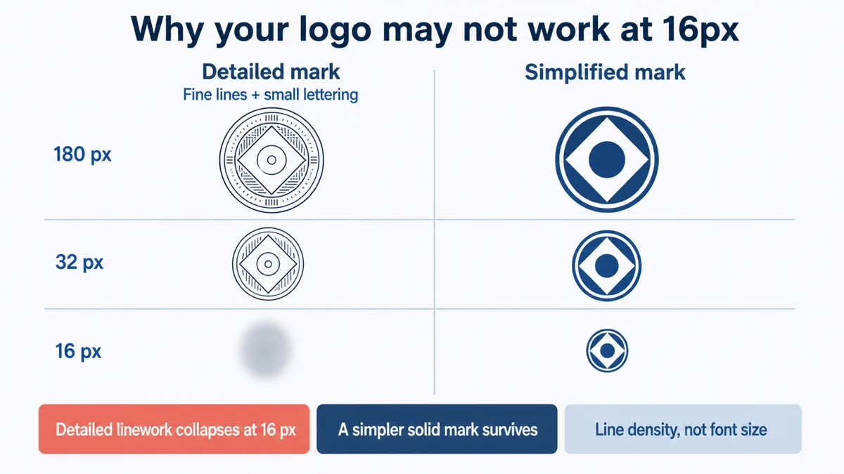
What survives is a single shape with one or two colours and generous internal space: one letter rather than a word, a silhouette rather than an outline, a solid form rather than a thin stroke. Fine gradients flatten, hairlines vanish or alias into dotted lines, and detail near the edge is the first thing lost. Draw a simplified variant of your mark for icon use and check it in the preview above — comparing the 16 px square against the 180 px one usually makes the decision obvious. If the mark is unreadable in the first square it will be unreadable in a tab, and no export setting rescues it.
The image size slider is part of the same trade. Padding around a mark that runs to the edge looks tidier at 180 px, but at 16 px every percent of margin is taken out of the 256 pixels you had to draw with — drop to 80% and the artwork is rendering in roughly 164. Use it when the mark genuinely collides with the frame, and check the 16 px square afterwards rather than trusting the large one.
Questions
Is my image uploaded to a server?
No. The image is decoded by your browser, drawn to canvases, and encoded to PNG by the Canvas API. The ICO file is assembled from those PNGs in JavaScript. This is a static site with no upload endpoint and no account — you can load the page, disconnect from the network, and the generator still works.
Why is the apple-touch-icon opaque?
iOS does not honour transparency in a home screen icon: it composites any alpha onto black, so a transparent logo arrives as a dark tile. The generator fills the 180 × 180 canvas edge to edge with a colour you choose before drawing — corners included, even when a corner radius is set, because iOS applies its own mask. The other files follow the Background control and keep their alpha when it is set to Transparent, because tabs and Android launchers handle it.
What does the corner radius do to the background colour?
The radius clips the square, so a rounded icon’s corners are cut away and left transparent — the background colour fills the shape inside the curve, not the corners outside it. That is what you want for a tab or an Android launcher, which draw the icon on their own surface. The apple-touch-icon is the one exception: its fill is painted edge to edge before the clip, corners included, because iOS applies its own rounded mask and an already-rounded icon would show gaps at the four corners.
Do I still need favicon-16x16.png?
Usually not. Every current browser reads the 16 and 32 px images out of favicon.ico, so the standalone PNGs are duplicates. They matter only for older browsers that ignore ICO files, and that is exactly what the legacy set adds. If you are unsure, the minimal set is the safer default: fewer files, and the head snippet stays short.
What about SVG favicons?
A raster source cannot become a true SVG. Tracing a PNG produces an approximation with different edges, not your original artwork, so this tool does not pretend to offer it. If you want an SVG favicon, export one from the vector file the logo was drawn in and add it alongside the ICO — browsers that support it use the SVG and the rest fall back. Keep the ICO regardless; SVG support is not universal.
Related
For the full background on each size, the head tags, the manifest and the caching traps that make a changed favicon look unchanged, read the favicon sizes guide — the full guide behind this tool. If your source is in the wrong format or needs flattening onto a background first, the Image Converter handles that in a batch.