
Favicon Sizes and Formats That Actually Work
Search "favicon sizes" and you will find checklists with twelve or more files — 16, 32, 48, 96, 144, 152, 167, 180, 192, 512, an .ico, several PNGs, and a manifest. Almost none of that is required anymore. Here is the small set that actually covers real browsers and devices, and why the rest of the list exists.
Why this is still confusing
The favicon has one of the longest, messiest histories of any web asset. It started in 1999 as a single 16×16 .ico file that Internet Explorer looked for at /favicon.ico, no HTML tag required. Every platform that came after — iOS home screen icons, Android adaptive icons, Windows tile pins, PWA manifests — added its own convention on top instead of replacing the old one, because breaking the original behavior would have broken every existing website. The result is a spec that never got cleaned up, just extended, and most of the size lists floating around the web are copy-pasted from an era when more of those extensions genuinely mattered.
Modern browsers also got much better at working with whatever you give them. Chrome, Firefox, and Safari can all take a single scalable icon and generate the small tab-size rendering from it. The long checklist is legacy insurance, not a current requirement, and most of it is safe to skip for a typical site.
The set that actually covers real usage
Three files, in practice, cover the overwhelming majority of browsers and devices:
- favicon.ico, containing a 32×32 image — still the fallback every browser checks at the site root by default, even with no <link> tag present. The .ico container format can technically hold multiple resolutions, but a single 32px image inside it is sufficient for how browsers use it today.
- A 180×180 PNG as apple-touch-icon — what iOS uses when a user adds your site to their home screen. iOS does not read favicon.ico for this purpose at all; without this file, it screenshots the page instead, which looks noticeably worse as a home screen icon.
- An SVG favicon — scales cleanly to any tab size, any pixel density, and supports the dark-mode media query covered below. Modern browsers prefer it when both an SVG and an .ico are declared.
In the document head, that is:
| Tag | Purpose |
|---|---|
| <link rel="icon" href="/favicon.ico" sizes="32x32"> | Legacy fallback, checked automatically even without this tag |
| <link rel="icon" href="/icon.svg" type="image/svg+xml"> | Preferred by modern browsers, scales to any size |
| <link rel="apple-touch-icon" href="/apple-touch-icon.png"> | iOS home screen icon, defaults to 180x180 |
Everything past these three — the 512px PWA icon, the Android adaptive icon variants, the Windows tile meta tags — only matters if you are building an installable PWA or specifically targeting Windows tile pins. Add them when that requirement is real, not preemptively.
Producing the raster half of that set by hand means exporting the same artwork at several sizes and packing an .ico. Our Favicon Generator does it from one source image: the favicon.ico, the 180px apple-touch-icon, and the 192 and 512 PNGs for when you do want the manifest. The SVG still has to come from your vector tool.
What each platform actually requests
- Desktop browser tabs render the icon at roughly 16×16 CSS pixels, scaled up for high-DPI displays. This is why the SVG or a well-drawn small PNG matters more here than a large source image does — the tab is the smallest, most-seen rendering of your icon.
- iOS home screen requests the apple-touch-icon at 180×180 (this covers the highest-density current iPhones; iOS scales down for older devices). iOS also automatically applies rounded corners and, on some versions, a subtle gloss — do not pre-round the corners in your source image or you get double rounding.
- Android home screen / PWA reads sizes from site.webmanifest rather than a link tag, typically 192×192 and 512×512, and supports a "maskable" variant with safe-area padding so adaptive icon shapes (circle, squircle, teardrop) do not crop your design.
- Search results (Google specifically) will show a small favicon next to your listing, sourced the same way as the browser tab icon, at a similarly small render size.
site.webmanifest: what it is for
A site.webmanifest file is a small JSON document describing your site as an installable app — name, theme color, background color, and a list of icons at declared sizes. It is what turns "Add to Home Screen" from a bookmark shortcut into something that looks and launches like a real app icon on Android. If you are not building a PWA and do not care about that installability, you can skip it entirely; a plain site with just the three files above works fine without one. If you do add it, link it with <link rel="manifest" href="/site.webmanifest"> and reference your icons by absolute path inside the JSON.
Designing to read at 16px
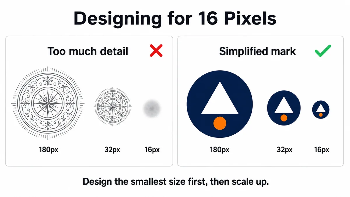
A browser tab icon is tiny, and most favicon designs fail not because of file format but because the source artwork was never checked at actual display size. Detail that reads clearly at 512px — a wordmark, fine linework, a gradient with several visible bands — turns into a gray smudge at 16px.
- Reduce to one dominant shape or letterform. A single bold glyph or icon silhouette survives downscaling; a detailed logo with multiple elements does not.
- Increase contrast and simplify color. Two or three flat colors read better at tiny sizes than a gradient, which tends to muddy into a single average tone.
- Thicken thin strokes. A hairline that looks fine at full size can disappear entirely once anti-aliased down to a 16px grid.
- Test by actually shrinking the export to 16px and looking at it, not by judging the full-size artwork and assuming it will hold up. It is the single most skipped step in favicon design.
Dark mode
Browser tab bars and OS chrome can be dark or light depending on system theme, and a favicon designed only for a light background can vanish against a dark tab strip (or vice versa). An SVG favicon can respond to this directly with a prefers-color-scheme media query inside the SVG's own embedded style block, swapping fill colors based on the user's theme. PNG and ICO favicons cannot do this — they are static images — so if dark mode support matters to you, the SVG favicon is not optional, it is the only format capable of it.
Short of that, picking a favicon design with enough contrast against both a white and a near-black background — usually by adding a thin outline or a mid-tone color rather than relying on pure black or pure white fills — covers most cases reasonably well without the added complexity.
Why the favicon will not update, and how to fix it
Favicons are cached unusually aggressively — browsers treat them as effectively static and will keep showing a stale icon for days or weeks even after a hard refresh of the page itself, because the favicon request is not tied to normal page-cache invalidation the way a script or stylesheet is. Three things reliably fix this:
- Change the filename or add a version query string — /favicon.ico?v=2 or renaming to /favicon-v2.ico forces a fresh request because the URL itself changed.
- Clear the browser's favicon-specific cache, which on Chrome is separate from the general cache clear (chrome://favicon-internals or clearing browsing data with "cached images and files" scoped in).
- Give it time. Even with a changed URL, some browsers and search engines re-crawl and re-cache favicons on their own schedule, and a search result's favicon specifically can lag behind the live site by days.
Frequently asked questions
Do I really need an .ico file in 2026?
Yes, as a fallback. Browsers still request /favicon.ico automatically even with no link tag present, and some older or less common browsers do not support SVG or PNG favicons at all. It costs one small file to cover that gap.
Can I just use a PNG instead of all these formats?
A single PNG covers most modern browsers reasonably well, but you lose the automatic .ico fallback for legacy cases and the SVG's dark-mode and infinite-scaling behavior. If you only add one file, the .ico is the safest single choice for compatibility.
What resolution should my source image be before exporting?
Design at a larger size like 512×512 for editing comfort, but always export and visually check a 16px version before finalizing — that is the size most people will actually see most often.
Does favicon size affect SEO?
Not directly as a ranking factor, but a missing or broken favicon in search results is a small trust signal against your listing compared to competitors whose icon displays correctly, and it is one of the cheapest things to get right.
Generate exactly the set described above
The Favicon Generator takes one source image and emits the files this article says you need: a favicon.ico bundling 16, 32 and 48, an apple-touch-icon at 180 that is flattened opaque so iOS does not composite your alpha against black, and android-chrome 192 and 512 if you pick the fuller set instead of the minimal one. It shows the mark rendered at a true 16 pixels while you adjust image size, corner radius and background color, so the check this article calls the most-skipped step happens before you export. Non-square sources can be cropped or letterboxed, and it hands back the <link> tags and the manifest JSON to paste, with an app name field feeding apple-mobile-web-app-title. Downloads as a ZIP, runs entirely in your browser, nothing uploaded.
Open Favicon Generator