
How to Extract a Useful Pixel Art Palette from an Image
You want a new character to feel as if it belongs beside an existing one. Copying one eyedropped color will not do that: the original sprite has shadows, base colors, highlights, and often stray edge colors. Start by finding the actual colors, then decide which ones form a usable palette.
Start with the file that still has clean pixels
Use the original PNG if you have it. A JPEG screenshot can introduce slightly different RGB values around every edge, so a character painted with six intentional colors may appear to contain hundreds. A lossy WebP can do the same. The palette extractor counts decoded colors exactly; it does not pretend those new near-matches are the same paint.
Before uploading, crop away unrelated UI, borders, or a large flat background if you want the character's palette. Otherwise the background may rank first simply because it occupies the most pixels. For a transparent sprite, adjust the minimum alpha threshold to ignore almost invisible edge pixels.
A practical six-color character palette
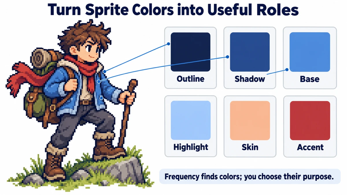
Imagine a 32 × 32 hero with a blue jacket. The extracted list includes two blues, a pale highlight, a dark outline, skin, and a warm accent. Do not copy the six highest-frequency entries blindly. Sort them by job: outline, jacket shadow, jacket base, jacket highlight, skin, and accent. The shadow-to-base-to-highlight sequence is a color ramp. That relationship matters more than the order the colors appear in the frequency list.
- Upload the clean sprite and inspect the frequency list. Copy the hex codes for colors that visibly belong to the character.
- Put each code beside its role in a small note: for example, jacket shadow, jacket base, jacket highlight. If two codes look indistinguishable, zoom into the original before deciding whether both are intentional.
- Draw a new character using the same outline and ramp logic. Reuse exact colors where consistency helps, but change the accent or material colors when the new character needs a different identity.
- Export CSS or JSON to preserve the chosen values. Treat that export as a working list, not as proof that every counted color should be in your final palette.
Why a photograph produces an unhelpful result
A photo contains many gradients and compression variations. Exact counting tells you which RGB triples occur most, but it does not cluster similar colors or choose pleasing ramps. If your goal is to reduce a photo to twelve stylized colors, you need quantization or manual palette design, not just extraction. The ImageMint tool intentionally reports what is present in the pixels; it does not recolor the image.
For a larger project, keep a reference sheet with named swatches. Analyze new artwork to spot accidental shades. Nearest-neighbor upscaling can make existing pixels easier to inspect, but it cannot undo blur already baked into a source. Recover a lossless original when possible.
Read alpha and percentages correctly
A 32 × 32 canvas contains 1024 pixels. Suppose only 600 pass the chosen alpha threshold, and 150 of those use the jacket base color. The reported frequency is 150 ÷ 600 = 25%, not 150 ÷ 1024. Transparent padding does not count as a color, and lowering the threshold may bring faint edge colors back into the list.
The default threshold of 128 includes roughly half-opaque pixels and above. A value of 255 includes fully opaque pixels only. Start at 255 for deliberately hard-edged artwork, then compare with 128 if the sprite has useful soft edges. Changing Minimum alpha clears the previous result; run analysis again before comparing counts.
Export a shortlist without losing rare accents
Top 8, 16, 32, and 64 are display and export limits. They do not reduce the image’s colors. If the top eight cover 85% of qualifying pixels, the remaining 15% belongs to hidden colors. Increase the limit to inspect an eye highlight or small accent before deciding the shortlist is complete.
The CSS download uses numbered variables such as --pixel-color-01. Rank can change when a character’s pose changes, so do not treat that name as a stable semantic role such as “jacket-shadow.” Rename chosen variables in your own project after assigning roles. JSON preserves the displayed colors and counts; it is not an indexed-palette image or a recoloring instruction.
Validate the palette on actual artwork
- Draw a small new pose with your chosen outline and three-color material ramp.
- Place it beside the source at native scale. Check readability of the silhouette and important accents.
- Analyze the new PNG and look for accidental shades from a soft brush or smoothing operation.
- Keep a named swatch reference and a clean original. A color-count report supplements visual judgment rather than replacing it.
Try the workflow
Upload a PNG, see exact color counts, copy hex values, and export CSS or JSON.
Inspect pixel-art colors →