
How to Write AI Prompts That Produce Usable Sprite Sheets
Asking an image model for "a sprite sheet of a knight" gets you a picture of a sprite sheet. It looks right in the preview and falls apart the moment you try to cut it up. The gap between a nice-looking output and a usable one is mostly prompt wording, and the fixes are specific and repeatable.
Why most AI sprite sheets are hard to use
Image models generate one continuous picture. They have seen thousands of sprite sheets, so they can reproduce the look of one convincingly — a character repeated in a tidy arrangement, roughly even gaps, consistent lighting. What they are not doing is computing cell boundaries. Nothing in the process enforces that row three begins exactly 384 pixels down.
Four problems follow from that, and each has its own fix.
- The grid is not a grid. Spacing drifts a few pixels per cell and the drift accumulates, so the bottom-right frames are the worst. Divide the width by four and your cuts land through heads.
- The background is baked in. Ask for a sprite sheet and you usually get an opaque one — white, grey, a soft gradient, or a rendered checkerboard that is drawing transparency rather than being transparent.
- There is text on it. Reference sheets in the training data are covered in labels: "WALK CYCLE", frame numbers, an artist watermark. The model reproduces that convention, generally as garbled pseudo-letters.
- The character drifts. Armor color changes between frames, the cape appears and disappears, proportions shift. Each cell is generated as part of one image, not as a consistent character posed repeatedly.
Rule 1: state the exact grid, in two forms
"A sprite sheet with several poses" leaves the layout entirely to the model, and you get five, or seven, or a ragged arrangement that is not rectangular at all. Say the layout numerically, and say it twice in different words: "arranged in a 4×4 grid, 16 sprites total, 4 rows of 4".
The redundancy helps because the model is matching text against images, and grid phrasing is not consistent in its training data. Two independent statements of the same fact reinforce each other. Adding "evenly spaced, equal spacing between all sprites, each sprite centered in its cell" will not give you pixel-exact cells, but it measurably reduces the drift you have to correct later.
Ask for fewer cells than you think you need. Quality falls off quickly as the cell count rises, because each sprite receives less of the model's attention and less pixel area. On a 1024×1024 canvas, a 3×3 gives roughly 340 pixels per frame and a 4×4 about 256 — both workable. A 6×6 gives about 170, and the poses start blurring into each other. If you need twelve frames, two 6-sprite generations usually beat one 12-sprite generation, and you can regenerate half the set when only half is bad.
Rule 2: specify canvas dimensions
Whatever your generator lets you set, set it. Pick dimensions that divide evenly by your grid: 1024×1024 divides cleanly by 2 and 4 but gives 341.33 for 3 columns. A 1024×768 canvas for a 4×3 layout gives exactly 256×256 cells. Even though the model will not honor the cell boundaries precisely, starting from dimensions that divide evenly removes one whole source of rounding error from everything you do afterwards.
Also decide resolution based on the target, not on impressiveness. If the sprite renders at 64×64 in your game, generating at 4096×4096 does not add usable detail — it adds detail that vanishes on downscale, and it makes anti-aliased edges harder to clean up. Generate at two to four times your target size and downscale, rather than at sixteen times.
Rule 3: ask for transparency, then verify it
Put "transparent background" in the prompt, add "PNG with alpha channel", and if your tool supports negative prompts, add background, backdrop, scenery, floor, shadow there.
Then check whether you actually got it, because this is the single most common trap. Models frequently render a light-grey and white checkerboard pattern — the visual convention image editors use to display transparency — as literal opaque pixels. It looks exactly like a transparent background in a thumbnail. It is a picture of one.
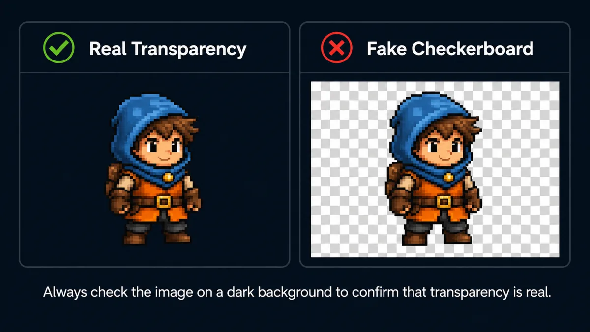
How to tell the difference in a few seconds:
- Open the image over a dark background — drag it into a browser tab with dark mode, or view it on a black slide. Real transparency shows the dark backdrop through it; a fake checkerboard stays light grey.
- Zoom all the way in on the checker squares. Real editor checkerboards are drawn at a fixed screen size regardless of zoom; a baked one scales up with the image and reveals soft, imperfect, slightly varying squares.
- Check the file format. A JPG cannot hold transparency at all — the format has no alpha channel. If your generator handed you a JPG, the background is opaque, full stop.
If you get a solid background anyway — which happens often, since several popular generators simply cannot emit alpha — do not fight the prompt. Ask instead for a background color that appears nowhere in your subject: "flat solid magenta background, #FF00FF, no gradient, no shadow". Bright magenta and neon green are the traditional choices for exactly this reason. Then remove it in one pass with background removal before you slice. Removing it once on the whole sheet is one operation and one consistent result; doing it on sixteen frames afterwards is sixteen chances to diverge.
Whatever route you take, remove the background before slicing rather than after. That order matters twice over: it is less work, and content-based slicing needs the alpha channel to find sprite boundaries in the first place.
Rule 4: say no to text, explicitly
Add "no text, no labels, no numbers, no watermark, no signature, no title, no frame borders" to every sprite sheet prompt. In tools with negative prompts, put the same terms there and add letters, typography, caption, UI, logo.
It will not work every time. The association between "sprite sheet" and labelled reference art is strong in the training data, and some models will add a caption regardless. The listing is still worth including because it reduces the rate, and a stray label in a corner is easy to crop — a label sitting between your sprites is not, since it reads as content to any automatic detection and gets sliced out as its own frame.
The same applies to decorative frame borders. "No frame borders, no card borders, no drop shadow behind sprites" heads off the model drawing each cell inside a little bordered box, which looks charming and destroys any chance of a clean cut.
Rule 5: pin the style and describe one subject per cell
Consistency across cells is the hardest thing to get and the most valuable. What helps:
- Name the style precisely. "16-bit pixel art, SNES era, limited palette" constrains the model far more than "pixel art". "Flat vector, thick uniform outlines, no gradients" likewise.
- Describe the palette. "Restricted palette of 8 colors: steel blue armor, brown leather, gold trim". Naming the actual colors keeps armor from drifting from silver to bronze halfway through the sheet.
- Fix the camera and lighting. "Side view, orthographic, flat even lighting, no cast shadows". Shadows in particular cause trouble: a shadow under each sprite becomes part of that sprite's bounding box and shifts the alignment.
- One subject per cell, stated. "Each cell contains exactly one full character, no overlap between cells, clear empty space between sprites". Overlapping sprites are the case no automatic slicer can resolve, because there is no gutter to find.
- Enumerate the poses. Rather than "a walk cycle", list them: "row 1 walking right, row 2 walking left, row 3 idle, row 4 attack". You get better coverage and you know what you are looking at afterwards.
Two complete example prompts
Pixel-art character sheet
16-bit pixel art sprite sheet of a knight in steel blue armor with a brown leather belt and gold trim. Arranged in a 4x4 grid, 16 sprites total, 4 rows of 4, evenly spaced with equal gaps, each sprite fully centered inside its cell with clear empty space around it. Row 1: walk cycle facing right. Row 2: walk cycle facing left. Row 3: idle breathing. Row 4: sword attack. Side view, orthographic, flat even lighting, no cast shadows, restricted 8-color palette, consistent character proportions and colors across every frame. Transparent background, PNG with alpha channel. No text, no labels, no numbers, no watermark, no frame borders, no background scenery. 1024x1024.
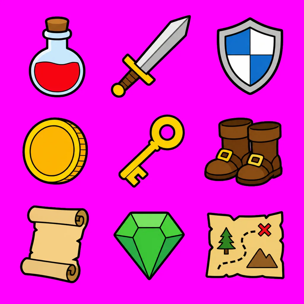
Flat-vector item icon set
Flat vector game item icons, thick uniform black outlines, no gradients, no shading. Arranged in a 3x3 grid, 9 icons total, 3 rows of 3, evenly spaced, each icon centered in its cell with generous empty margin. Items: health potion, mana potion, iron sword, wooden shield, gold coin, bronze key, leather boots, spell scroll, red gem. Consistent line weight and palette across all nine. Solid flat magenta background #FF00FF, no gradient, no shadow. No text, no labels, no watermark, no borders. 1024x1024.
Note the deliberate difference: the second asks for flat magenta rather than transparency. If your generator cannot emit real alpha, asking for a color you can key out cleanly beats asking for something it will fake. Adapt to what your tool actually does.
The workflow after generation
- Generate with the constraints above. Produce three or four variations — generation is cheap and consistency is luck-dependent, so pick the best rather than fixing the first.
- Check the background against a dark backdrop. Real alpha, or a keyable flat color? If it is opaque, run background removal on the whole sheet now.
- Slice at Sprite Sheet Slicer. Magic Slice reads the alpha channel to find the real boundaries, whatever the spacing turned out to be. If the sprites touch or a glow bridges the gaps, switch to Manual & Preset and drag the lines — six drags for a sixteen-frame sheet.
- Pad to a common size if you trimmed each frame to its own bounds. Frames of differing dimensions on a shared pivot make an animation appear to bob. Center horizontally, bottom-align vertically, pad with transparency.
- Import as PNG. See the Unity and Godot guides for the import settings that matter.
Frequently asked questions
Which generator produces the most usable sprite sheets?
The one that can output a real alpha channel, whichever that is for you today. Grid regularity is comparably bad across all of them, and that is fixable in slicing. Baked-in backgrounds are the expensive problem, so native transparency support is worth more than marginally better art.
Can I ask for a specific pixel size per sprite, like 32×32?
You can ask, and it will be treated as a style hint rather than a constraint. Models do not control output at pixel granularity. What you get is art that resembles low-resolution pixel art rendered at high resolution. Downscale afterwards with nearest-neighbour to get true 32×32.
The character changes appearance between frames. Any fix?
Partially. Naming exact colors and materials helps a lot. Beyond that, generate fewer sprites per sheet, or use image-to-image with a reference of your chosen character so each generation starts from the same visual anchor rather than from text alone.
Should I generate a sheet at all, or one sprite at a time?
One at a time gives better consistency and far more pixels per sprite; a sheet is faster and cheaper. A practical compromise is generating in small batches of four to six related poses, which keeps a shared visual context without starving any single frame of resolution.
Prompts to start from, tools to finish with
Grab a copy-paste prompt from the creative library, generate your sheet, then cut it into frames in the browser. Both run locally in your browser with nothing uploaded.
Browse prompt libraryOpen Sprite Sheet Slicer