
Instagram Image Sizes That Do Not Get Cropped
There are a thousand lists of Instagram pixel dimensions and almost none of them answer the question people actually have, which is not "what size should I export?" but "why did Instagram cut the top off my photo?" The answer is a rule, not a number: Instagram accepts a limited band of aspect ratios, and anything outside that band gets cropped from the centre. Understand the rule and the numbers stop mattering nearly as much.
The rule behind every "why did it crop?" question
Instagram does not display your image at whatever shape you give it. Every surface in the app — the feed, a Story, a Reel, the profile grid — has a fixed frame, and your upload has to be fitted into that frame. When your image's aspect ratio already matches one Instagram supports, the fit is exact and nothing is lost. When it does not, Instagram picks the nearest supported ratio and cuts the excess away.
Two things about that cut are worth internalising, because they explain nearly every complaint people have about the platform's handling of photos.
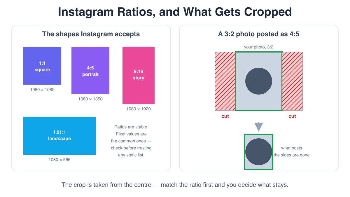
First, it crops from the centre. Instagram does not look at your photo, find the subject, and crop around it. It takes the centre of the frame and trims equally from opposite edges. On a too-tall image, that means you lose the top and the bottom — typically the sky and the ground, and very often the top of someone's head. On a too-wide panorama, you lose the left and right sides, which is exactly where the interesting parts of a panorama live. The upload flow does give you a chance to reposition the crop manually, but if you skim past it, centre is what you get.
Second, cropping and compression are separate problems. Instagram re-encodes every image you upload, without exception. There is no export setting, no magic pixel size, and no file format that gets you out of that re-encode. So matching Instagram's dimensions does not preserve your compression quality — that battle is already lost. What matching dimensions does control is whether the platform crops your composition and whether it has to resample your pixels. Those are the two things still under your control, and they are the two things this article is about.
Feed posts: the supported band
For a normal feed photo, Instagram supports a range of aspect ratios running from landscape at roughly 1.91:1 at the wide end, through square at 1:1, to portrait at 4:5 at the tall end. That band has been stable for years, which is why it is worth learning as a band rather than memorising specific pixel counts.
| Feed format | Aspect ratio | Commonly used pixel size | Use it when |
|---|---|---|---|
| Square | 1:1 | 1080 × 1080 | Safest default; matches the classic profile thumbnail shape |
| Portrait | 4:5 | 1080 × 1350 | Maximum vertical screen space in the feed |
| Landscape | 1.91:1 | 1080 × 566 | Wide scenes; smallest footprint on a phone screen |
| Story / Reel | 9:16 | 1080 × 1920 | Full-screen vertical surfaces |
Take the pixel column as the widely used convention rather than a specification handed down from Meta. The aspect ratios are the stable part; 1080 is the width the ecosystem has settled on because it is the width Instagram has long served full-size feed images at. If you export at 1080 on the long-constrained edge and get the ratio right, you are aligned with what the platform wants.
Why 4:5 is the tallest post you can make
Portrait posts perform well for an unglamorous reason: a taller image occupies more of the screen as someone scrolls, so it holds attention longer. Creators noticed this immediately and the obvious next question was whether you could go taller still — 2:3, or 9:16 like a Story.
You cannot, and 4:5 is where it stops. Instagram caps feed height because the caption, the account row, and the action buttons all have to share the screen with the image. A feed post that filled the viewport vertically would push the entire interface off screen. So 4:5 is not an arbitrary number, it is the tallest shape that still leaves room for the rest of the post.
The practical consequence: if you hand Instagram a 9:16 vertical photo as a feed post, it will be cut down to 4:5, from the centre. Roughly the top quarter and the bottom quarter of your composition are gone. This single mismatch is the most common cause of the "Instagram cropped my photo" complaint, because phone cameras shoot at tall ratios by default and Stories train you to think vertical.
The profile grid is a separate frame
One more crop happens after the fact and catches people out. Your post appears twice: once at its real ratio in the feed, and once as a thumbnail in your profile grid. The grid has its own fixed cell shape, so a post whose ratio does not match the cell gets cropped again for the thumbnail — centre-cropped, same as before.
Stories and Reels: 9:16, minus the parts you cannot use
Stories and Reels are full-screen vertical surfaces, so the target is 9:16, commonly exported as 1080 × 1920. Anything shorter than 9:16 is either letterboxed with a blurred or solid backdrop, or scaled up and cropped, depending on the surface and how you post it.
The complication is not the ratio, it is that a Story is not a clean canvas. The app draws its own interface on top of your image: the profile row, the progress bars and the close button along the top, and the reply field, sticker prompts and share controls along the bottom. On a Reel, the caption, the audio label and the action column sit over your video too. Whatever you place under those elements is either covered or unreadable.
So a Story has a safe area: a band down the middle where your content is guaranteed to be visible. The usual working figure is to keep roughly the top 250 pixels and the bottom 250 pixels of a 1920-tall canvas clear of anything important, leaving a safe band of about 1080 × 1420 in the centre. Treat that as a practical convention rather than a published constant — the exact overlay heights differ between iOS and Android, between phone models with different notch and home-indicator geometry, and between app versions. The principle is what matters: design in the middle, let the edges be background.
Reels have one extra frame to think about. The cover image, which is what represents the Reel on your profile grid and in the Reels tab, is cropped out of the full 9:16 frame at a different ratio. A cover that looks perfect full-screen can lose its subject entirely once it is cut down to a grid tile. If a Reel matters, set its cover deliberately and check how the tile looks, rather than accepting the frame the app picked for you.
Carousels: every slide inherits the first one
This is the trap, and it is worth its own section because nothing in the interface warns you about it.
A carousel post has a single aspect ratio for the whole post, and that ratio is taken from the first slide you add. Every subsequent slide is fitted into that same frame. Lead with a square photo and then add a portrait one, and the portrait slide is centre-cropped to square — even though, posted on its own, it would have been perfectly acceptable at 4:5.
In practice most people choose 4:5 for carousels, because it is the tallest option and a carousel is usually trying to hold attention across several slides. Square is the more forgiving choice if your slides are a mix of photos you do not control. Either works; what does not work is deciding by accident, which is what happens when you simply select images in whatever order the gallery offers them.
The profile picture
The profile picture is displayed as a circle, so the practical rule has nothing to do with pixel counts: upload a square image and keep everything that matters inside the circle inscribed in that square. The corners will be cut, always, on every surface that shows your avatar. Logos with text along the bottom edge are the classic casualty.
It is displayed small — a few dozen pixels in a comment thread — so detail is wasted, but do not compensate by uploading something tiny either. A commonly used upload size is 320 × 320, and going somewhat larger costs nothing since it will be downscaled anyway. The real design constraint is legibility at thumbnail size: one strong shape, high contrast, no fine text.
Why a 4K upload does not give you a sharper post
The intuition is reasonable: more pixels in, more detail out. It is wrong here, and understanding why saves you a lot of pointless exporting.
Instagram stores and serves feed images at its own dimensions, and the long-standing full-size width for a feed photo is 1080 pixels. Upload a 4096-pixel-wide image and the server downsamples it to that width, then re-encodes it. Your extra pixels are discarded before anyone sees the post. Worse, the downsample is a resampling pass: the server applies its own scaling filter and its own sharpening decisions to your image, and you have no control over either. Fine texture, small text and dense pattern are exactly what resampling smears.
Uploading at the target size means the only transformation is the re-encode. Uploading far above it means a resample and a re-encode. That is why the advice is to match, not to maximise.
Undershooting, however, genuinely does hurt, and it is not symmetrical with overshooting. If you upload an 800-pixel-wide image, it has to be scaled up to fill a 1080-wide frame, and upscaling invents pixels that were never captured. The result is visibly soft in a way that no compression setting recovers. Between the two errors, too small is much more damaging than too large.
Sanity-check the numbers instead of trusting a list
Every static list of Instagram dimensions, this one included, starts decaying the day it is published. Meta changes the profile grid, adjusts what the feed accepts, adds a surface, and quietly updates the width it serves images at. The aspect ratios move slowly; the pixel figures move faster; and the third-party listicles copy each other and go stale together.
Three habits keep you honest:
- Look at your own account. The shape of your profile tiles, how much of a Story the interface covers, and where a carousel crops are all directly observable in thirty seconds on your own phone. That beats any article.
- Post a test image with markings. Export a plain image with a border and a centre cross at the ratio you plan to use, post it privately or to a throwaway account, and see what survives. This is the only method that gives you the current answer rather than a remembered one.
- Trust ratios over pixel counts. If you export 4:5 you are correct whether the platform serves at 1080, 1440 or something else next year. If you hard-code 1080 × 1350 into a template and the ratio band shifts, you find out from a bad crop.
If you are cutting one image into a nine-tile profile grid rather than posting single photos, the sizing rules are different again — each tile has to be identical and match the grid cell shape. That workflow is covered separately in How to Split a Photo into an Instagram 3x3 Grid.
A short workflow that avoids all of this
- Pick the surface first. Feed, Story, Reel and carousel have different frames, so decide where the image is going before you export it.
- Pick the ratio, not the pixels. 1:1, 4:5 or 1.91:1 for the feed; 9:16 for Stories and Reels; square for the avatar.
- Crop to that ratio yourself. This is the whole point — you choose what is lost instead of letting a centre crop choose for you.
- Export at the target size, not above it. 1080 on the constrained edge is the conventional target. Never export below it.
- Check the second frame. Profile thumbnail for a feed post, safe area for a Story, cover for a Reel, first-slide ratio for a carousel.
Frequently asked questions
Why did Instagram crop my photo?
Because its aspect ratio was outside the band Instagram supports for that surface, so the image was fitted to the nearest supported ratio and the excess was trimmed from the edges, centred. A tall phone photo posted to the feed loses its top and bottom because the feed stops at 4:5; a panorama loses its sides. Crop to a supported ratio yourself before uploading and the crop stops being a surprise, because you made it.
Does uploading at 4K make my post sharper?
No. Instagram serves feed images at its own width — long established as 1080 pixels — so anything larger is downsampled on the server before it reaches a viewer, using a scaling pass you do not control, and then re-encoded on top of that. You gain nothing and add one lossy step. Uploading smaller than the target does hurt, visibly, because the image has to be upscaled. Match the size; do not maximise it.
What size should a carousel be?
Whatever ratio you choose — but every slide must be that same ratio, because the carousel takes its shape from the first slide and centre-crops the rest to match. 4:5 is the usual choice since it is the tallest feed ratio and a carousel is trying to hold attention. Resize every slide to the chosen ratio before you start, and add the ratio-setting image first.
Why does my Story get covered by buttons?
Because the app draws its interface over your image: progress bars, profile row and close button at the top, reply field and share controls at the bottom. Nothing you export changes that. Keep important content out of roughly the top and bottom 250 pixels of a 1080 × 1920 canvas — a working figure, since overlay heights vary by device and app version — and treat the edges as background rather than as space for text.
Resize to an Instagram preset before you upload
The Instagram Resizer takes a photo and fits it to whichever preset you pick — square, 4:5 portrait, 1.91:1 landscape, or 9:16 for Stories and Reels. Choose fit to keep the whole image and fill the leftover space with a colour or a blurred copy of the photo, fill to crop to the frame, or stretch if you really want it. You see the crop in a preview before you commit, so you decide what gets cut rather than finding out after you post. It runs entirely in your browser — nothing is uploaded anywhere.
Open Instagram Resizer